A Preview of a Not-So Subtle Upgrade
It’s no secret that I like and use the Reeflex Pro Camera app as my go-to camera app of choice. It has been since it hit the market all those years ago. I still have more camera apps on my iPhone than anyone needs (right, Dwight?), and occasionally I’ll open one up and give it a go.
With each iteration of iPhone comes a new version of iOS, and with it, some little tweaks here and there in design and function. September 2025 brought us a lot of newness, especially in Apple’s operating systems. They changed things up across all platforms from the look and feel of things right up to the naming of the OS’s. From one platform to the next, the version nomenclature was a little all over the place and resulted in confusion. Enter iOS 26.
A New Look
The last time Apple released a UI design change for their most popular product was in 2013 with iOS 7. Since then, the changes have been visually minor in the grand scheme of things. iOS 26 is a whole new design on the surface while maintaining a level of familiarity in the way we navigate our way through its structure. I believe Apple did it this way to avoid massive resistance from their customers. The biggest change in design is what Apple has called Liquid Glass.
This new glassy look really is remarkable, and Reeflex has incorporated it into Reeflex Pro Camera 3. And like Apple, while the team is introducing a newly designed camera app, it still has a familiar feel to it. One of the things that drew me to Reeflex Pro Camera in the first place was how intuitive it is to use. Most of the controls you want in a camera app are right there, front and centre. Version 3 remains just as easy to use, even though there have been some subtle changes to the layout. But first, I want to address the Liquid Glass part of it.
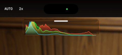
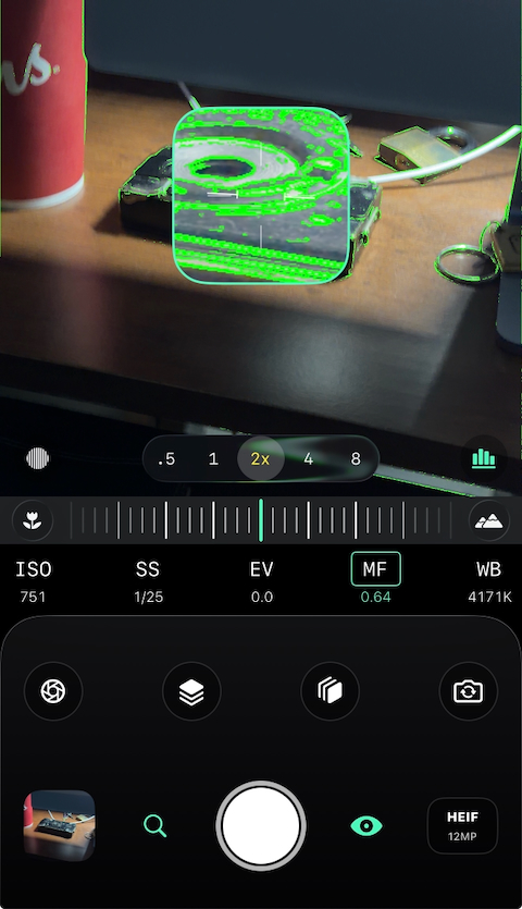
As you probably know, Liquid Glass is the effect you get on iPhone that gives the UI layers a clear—or opaque should you choose that option—appearance. For example, when you pull down the notifications, it’s like a thin layer of clear liquid has run down your screen. In Reeflex’s camera UI, this visual effect is present in two elements of the design: the camera selector and the histogram, if you have it activated. These utilitarian elements are in the viewfinder, so, in my opinion, it makes them a little less intrusive. I like that.
Old and New Features
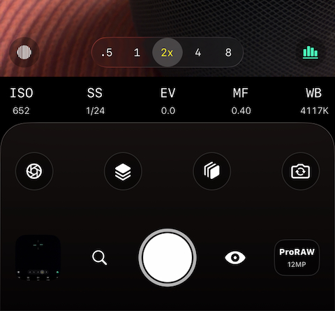
Reeflex Pro Camera 3 has the same camera controls across the bottom of the viewfinder as before, so nothing new there, but there are some very welcomed new features right within reach. The controls for your exposure helpers, the zebra stripes and histogram that occupied space directly above the shutter button, have been moved to the lower corners of the viewfinder in a non-obstructive way and now sit on each side of the new camera selector. Switching cameras before was not as convenient as it is now because you had to toggle through the different cameras using a single button. Now, any rear-facing cameras available on your iPhone are readily available at the bottom centre in the viewfinder, much like Apple’s Camera app. Additionally, the button that switches from the rear cameras to the Selfie Camera is now included in what I would call the Mode Selection row on the right side, and the Slow Shutter button that was there before, is now on the left side.
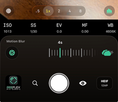
The Slow Shutter feature has been simplified in that the controls now stay in the Mode Selection row rather than pop up into the view finder. It is similar to ReeHeld and ReeXpose with a sliding scale to select the length of your shot sequence. And to switch between Motion Blur and Light Trails, you tap the icon at the right of the scale to toggle between the two.
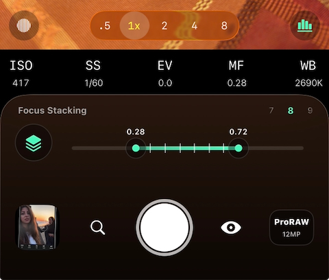
In the Mode Selection row, between the manual camera controls and the shutter button, we find two exciting new features in their place: Focus Bracketing and Exposure Bracketing.
Two Types of Bracketing
Focus Bracketing is the process where you take multiple frames with a set number of points of focus so you can stack them together using software that has that capability. The Focus Bracketing icon is the one with three squares stacked on top of each other. Tap the icon, and it slides to the left to reveal a scale and selector for the number of frames you want to shoot, from 3 to 100. On the scale, you can select the near and far points of the focus range from anywhere within the range of focus of the camera you are using. This is a very valuable feature to have for macro photos or landscape scenes where you want everything from the foreground to the background in sharp focus.
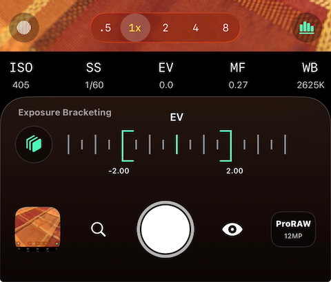
Exposure Bracketing is what you might use in difficult lighting situations where you can expose for either the highlights or the shadows, but not both in the same shot. Bracketing in Reeflex Pro Camera 3 allows you to set three exposure values in terms of under exposure, a correct exposure, and over exposure. When you tap the Exposure Bracketing icon, it behaves the same way as Focus Bracketing. The icon slides to the left, and you have a scale, with EV at the centre and room to move the adjusters left or right to plus or minus 4 in half-stop increments. The EV in the centre represents the exposure you have set, either automatically or manually using the exposure functions below the viewfinder. Bracketed exposures also need to be processed or blended together in capable software.
Burst Mode
Another feature that has been a popular request for Reeflex is Burst Mode. There’s no setting for it in the main camera UI because it’s just there; simply tap and hold the shutter button. There are a couple of options available to customize the way Burst Mode works, and they’re accessible in the app’s Settings, which is easy enough to locate.
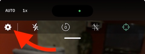
At the top of the viewfinder, you’ll find a small white line that, when pulled down, reveals the remaining camera features, which I’ll get to shortly, as well as the Settings icon (the gear on the left side). Opening the Settings gives you a page similar to the older version of Reeflex where you can discover their other apps, products, and community, etc., but there’s another page called Camera Settings.
This is where you can select the colour of the Focus Peaking highlight, enable location to embed the GPS data in your images, embed a thumbnail in Bayer RAW files, and finally set the way taking a Burst works. If you enable Burst on Tap, more functions appear. You can select the number of shots to take in the sequence ranging from 2 to 20, and Aggregate Burst Shots will stack them together in your Photos Library. Turning Aggregate off will display each shot of a burst as a single image.
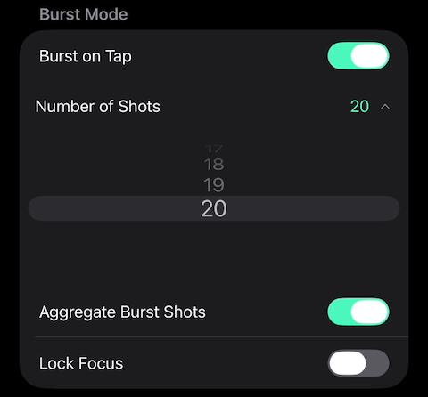
Also available in Burst Mode is the ability to lock focus. This is pretty self-explanatory and could be quite useful when using Burst Mode to capture a moving subject when there might be a chance of losing focus on it.
Getting back to the top of the viewfinder, remember when we pulled down on the little white line to reveal the Settings icon? That little “drawer” also holds features like the flash, timer, grid lines, and the level meter. They used to be present across the top of the screen at all times in the previous versions of Reeflex, but I think tucking them away until we need them is a better design attribute.
Before we get to another big change, I want to mention one more little convenient addition to Reeflex Pro Camera 3. Focus Peaking has moved its control to the right of the shutter button, and on the left side is a handy magnifier to assist in manual focusing. Tap the magnifying glass icon, and a portion of the viewfinder gives you a window that is zoomed in so you can see where your focus is. The nice thing about this feature is that it can work in conjunction with Focus Peaking, which gives you that extra assurance that you’ve achieved sharp focus.
Formats and Resolution
To access the Formats and Resolutions, tap the icon in the lower right corner of the UI, and a large window pops up where you can configure your capture combination. The top section has the usual suspects in HEIF, JPEG, ProRAW, and RAW, and in the lower section is the switcher for 12MP and 48MP.
When shooting in HEIF, JPEG, or ProRAW, you can choose between 12MP and 48MP. However, RAW capture is limited to 12MP, a restriction imposed by Apple that developers can’t bypass. In any format but RAW, Apple’s Fusion technology is used to create the final image. It analyzes multiple frames taken in a shot sequence and selects the best parts, then merges them together. When RAW is selected, Reeflex takes a single shot to make the exposure and doesn’t apply any processing. Like in the prior version of the app, this is just a Bayer RAW file, but the Reeflex team has added the Zero Processing tag to it.
An Updated Image Gallery
The remaining element of the UI that I’d like to mention is the image thumbnail in the lower left corner of the screen. This shows the last photo you took, and when you tap to preview the image, it opens like you would expect. You have the usual choices along the bottom of the screen, like Delete, Favourite, Info, and Share, but I want to highlight the Info feature. Version 3 has added a lot more metadata to the file information screen. When you tap the Info button, the metadata slides up, revealing the file name, iPhone model, exposure information, and the location where the photo was captured if you geotag your images.
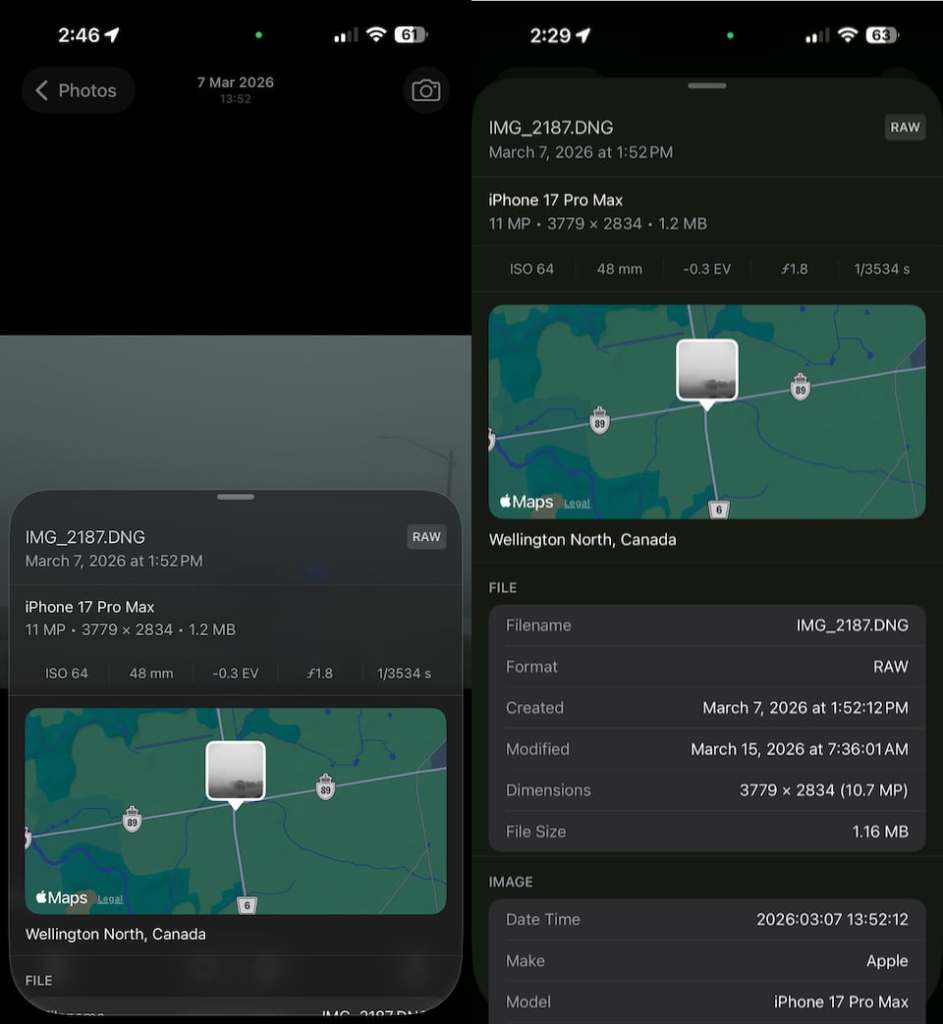
When I first opened this, I noticed something was cut off at the bottom, so I dragged the metadata up and discovered that there is a great deal of information available about the file in sections about the image, camera, lens, and location, which includes the GPS coordinates and elevation. How much value this information brings is up to the individual, but it’s certainly nice to see it being added.
From the Image Preview, you can tap the Photos button in the top left corner, and that takes you to the Gallery view where you can select photos to delete or share. In the lower left corner is a Filter icon where you can change the Gallery layout to fit 3 or 5 images across each row. Additionally, you can filter the images by Screenshots, Favourites, or show all items. A quick tap of the camera icon in the lower right corner gets you back to the fun part, taking more photos.
Final Thoughts
So that’s a written overview of the new Reeflex Pro Camera 3 app with some nice, updated code under the hood that makes it lightning fast, a little bit of a new look, and some very cool new features. I hope you got something valuable out of this review, and if you haven’t tried Reeflex Pro Camera yet, or any of their other camera apps, I think you’d be pleasantly surprised at how easy they are to use. I can’t wait till the weather improves where I live so I can venture out and try some Focus and Exposure Bracketing, and just enjoy the new look and feel of this well-designed camera app.
Version 3 is set to release April 2, so watch Reeflex’s website for details on pricing and confirmation of availability.
~ Greg McMillan
